Project detail
DINE N' DASH
Dine N’ Dash is a mobile app concept designed to reduce friction in the dining experience by allowing users to view their bill, pay instantly, and leave without waiting. The goal was to minimize uncertainty, reduce wait times, and improve operational efficiency for both diners and restaurant staff. Role


The Problem
Dining out often involves unnecessary friction. Long waits, unpredictable reservation availability, and delays in paying the bill create frustration for diners and inefficiencies for restaurants.
The core issue wasn’t the food or service — it was lack of transparency and control throughout the dining journey.
The core issue wasn’t the food or service — it was lack of transparency and control throughout the dining journey.
Key Insight
Through early research and personal observation, one insight stood out: diners don’t mind waiting — they mind not knowing how long they’ll wait or what comes next.
This uncertainty makes planning stressful and often leads diners to avoid peak hours or rush through meals once seated.
This uncertainty makes planning stressful and often leads diners to avoid peak hours or rush through meals once seated.
The Solution
Dine N’ Dash was designed to give diners clarity and control at key moments in the dining experience — before arriving, while dining, and when it’s time to leave.
The experience focuses on surfacing real-time information, enabling fast actions, and removing unnecessary waiting without disrupting the social nature of dining.
User Research & Validation
To validate the problem, I conducted surveys and informal interviews with frequent diners and restaurant staff.
Key findings included:
Most users felt frustrated by unpredictable wait times
Diners wanted visibility into peak hours before arriving
Waiting was often perceived as poor service, even when food quality was high
These insights confirmed the problem was behavioral and widespread — not anecdotal.
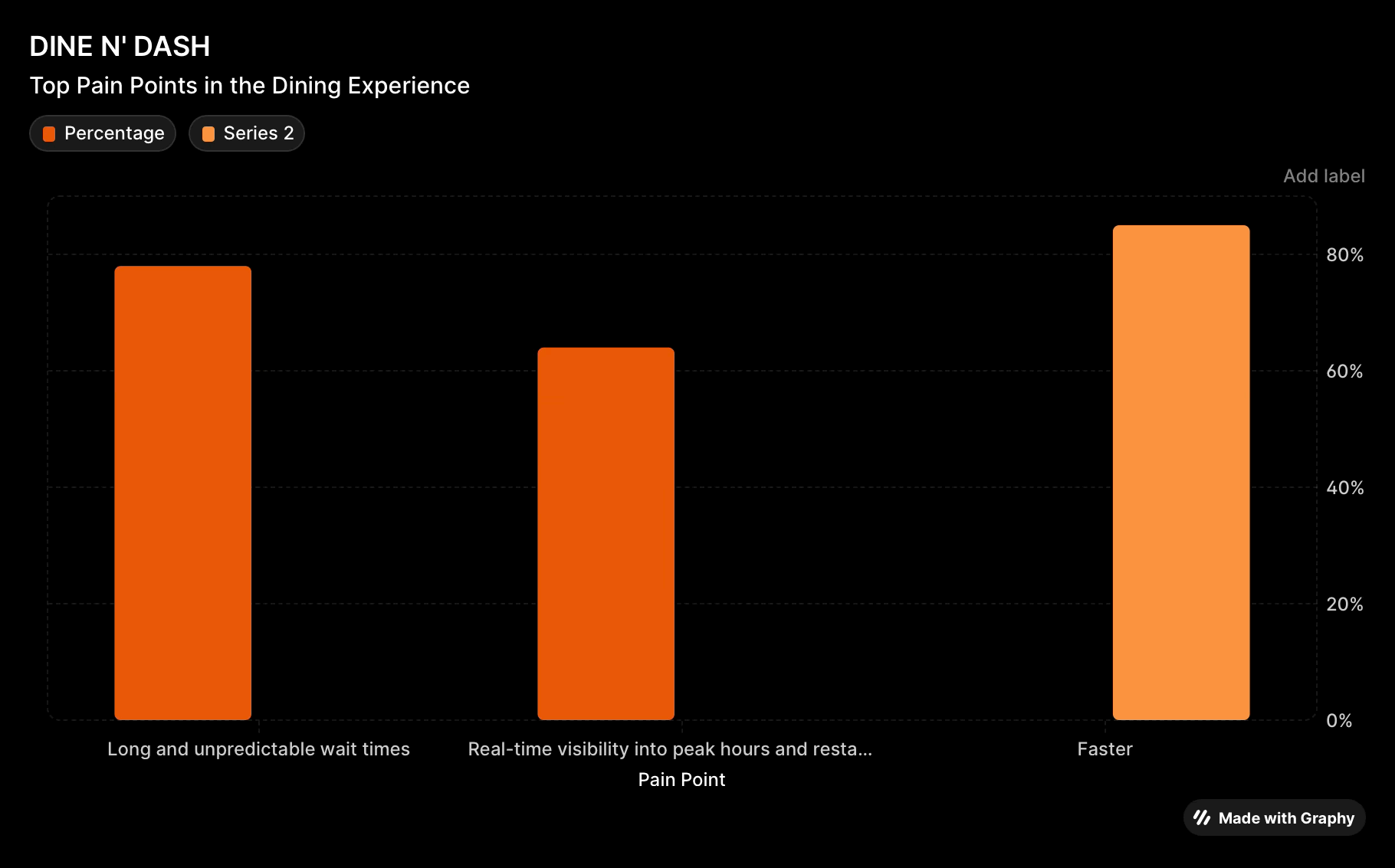
Key pain points identified from diner surveys
User Flow
I designed a streamlined flow that prioritizes speed and clarity at decision points, from discovering a restaurant to paying and leaving.
Flow highlights:
Browse restaurants with live wait indicators
Secure reservations instantly
Order ahead when applicable
Track table or order status in real time
Pay and leave without waiting for the check
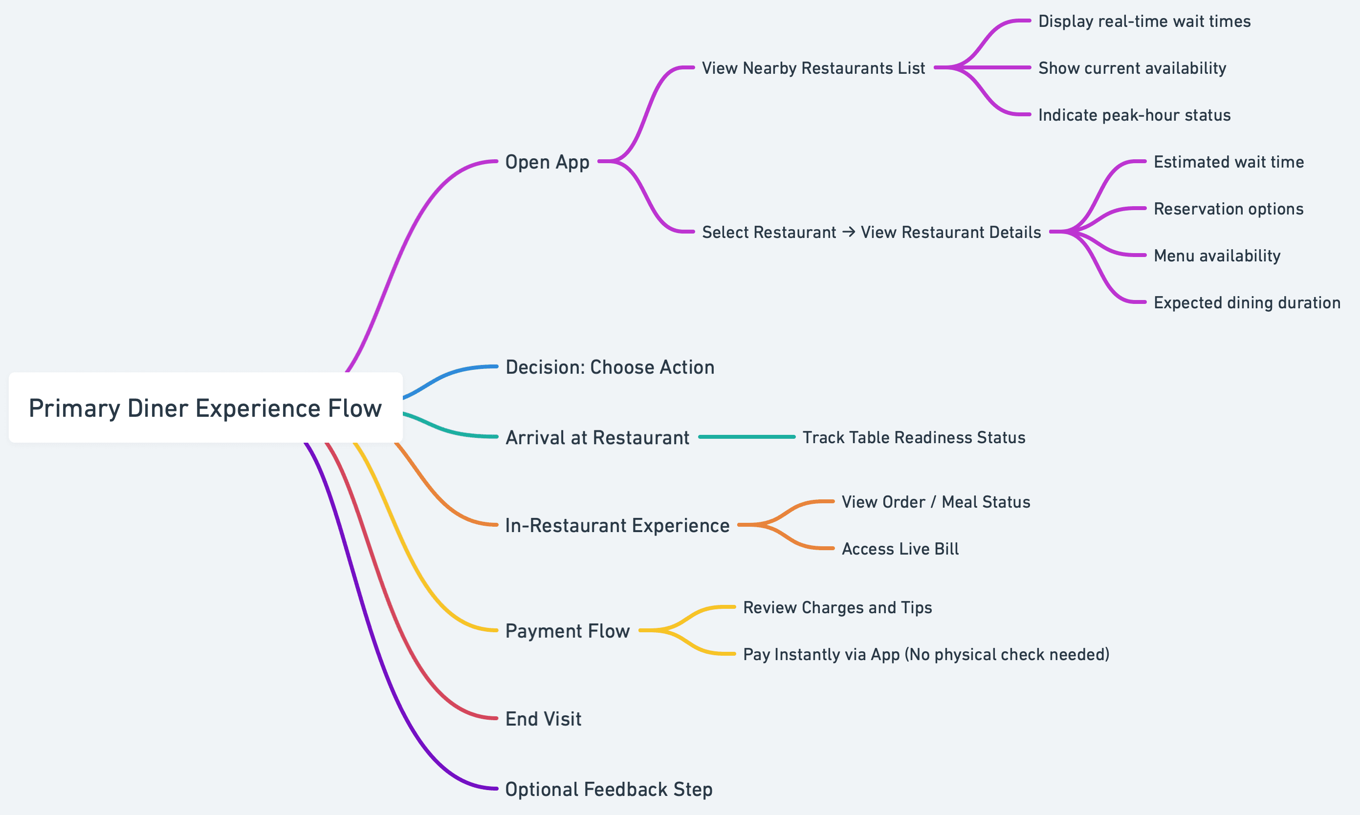
This flow reduces friction by surfacing timing and actions exactly when users need them.
Wireframes (Low-Fidelity)
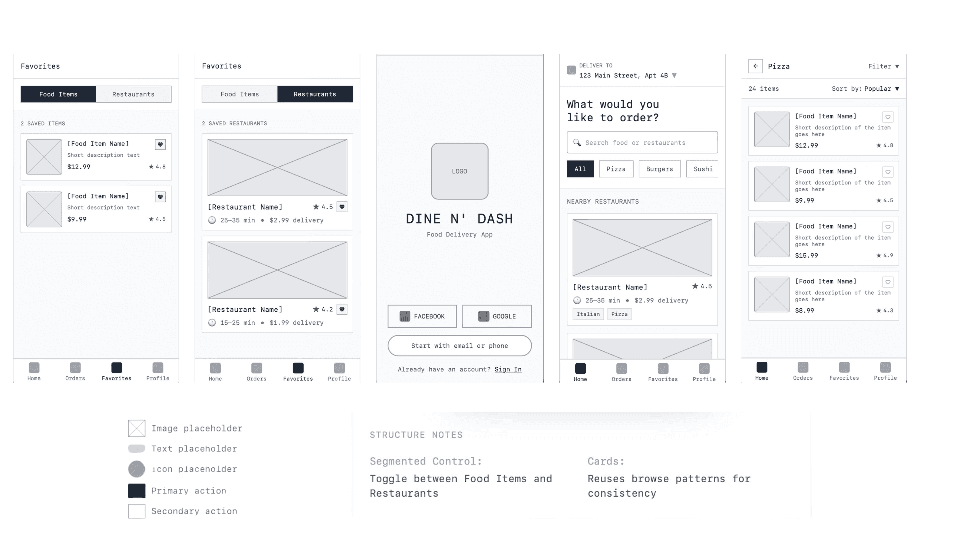
Before moving into high-fidelity design, I explored the core flow through low-fidelity wireframes. The focus was on validating hierarchy, clarity, and speed at each step of the dining journey, without distraction from visual styling.
High-Fidelity Design
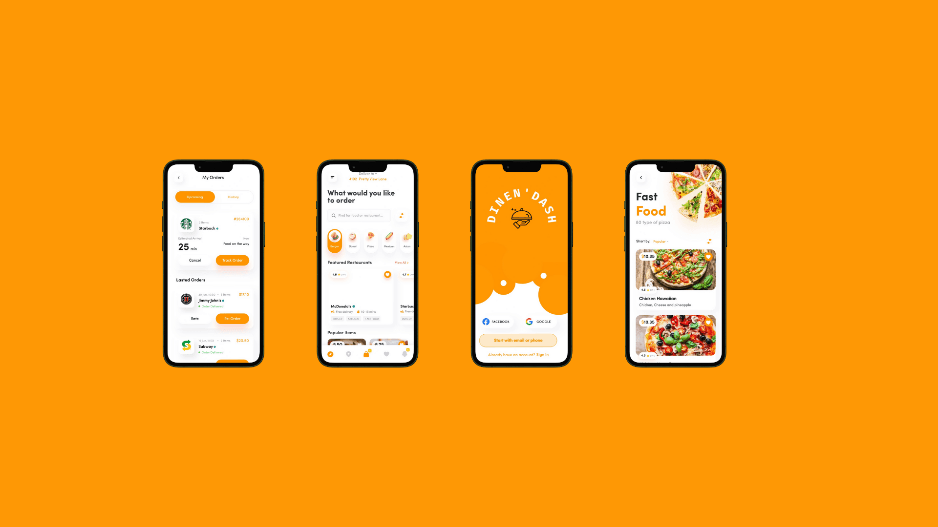
The final UI prioritizes speed, clarity, and confidence. Visual decisions were intentionally minimal to reduce cognitive load while maintaining a modern, restaurant-friendly aesthetic that supports quick decision-making.
Key Design Decisions
Live wait times and bill visibility were surfaced early to reduce uncertainty and perceived waiting, which users identified as more frustrating than the wait itself.
Design Decision: Pay Without Asking
Removing the need to flag down a server to pay allowed diners to leave on their own terms, improving perceived control at the end of the experience.
Design Decision: Minimal Interaction Steps
Primary actions were limited to one-tap decisions wherever possible to match the fast-paced dining context.
Testing & Iteration
I tested the prototype with frequent diners to validate clarity and speed across key moments.
Early feedback showed confusion around how wait times were sourced and how reservations could be modified.
In response, I added clearer labels, onboarding cues, and a flexible reservation management option to improve trust and usability.
Final Outcome
The final experience transforms dining from a waiting-heavy process into a confidence-driven flow. Dine N’ Dash gives users clarity before they arrive, control while they dine, and freedom to leave on their own terms.
Reflection & Learnings
What I learned:
Designing for time-sensitive experiences requires prioritizing perceived control as much as speed.
What I’d improve:
With more time, I’d validate the system with restaurant partners to further refine operational accuracy.
How this changed my design approach:
This project reinforced my focus on clarity, timing, and decision confidence in UX design.
